Designers’ Tips: How to Beautifully Decorate Your Country Veranda
Our experts – architects and designers – will tell you how to build and decorate a country veranda that will last a hundred years and still look stunning.
The Transition Moment
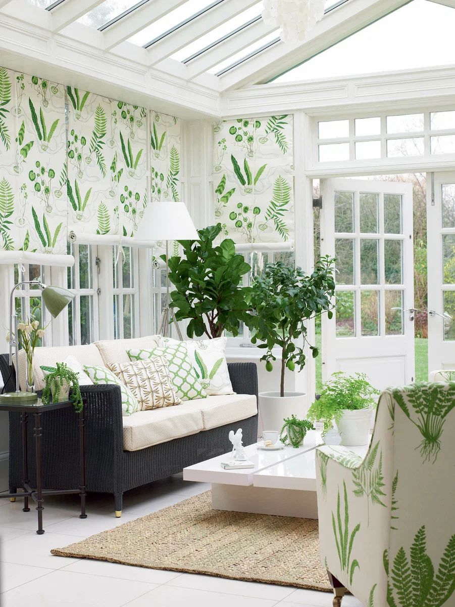
Decorator Veronica Blumgren: “For me, a veranda is an amazing place where a house stops being just a house and becomes a garden. Here, you are already outside, yet still on a soft sofa, where the scent of dew fills the air, your feet are dry, and you can walk around in your socks. It’s wonderful when the transition from the garden to the house and vice versa is smooth and gentle. I dream of having a veranda like the one in the photo. It has a relaxed atmosphere, it’s bright, fresh, and beautiful. The bold and stylish combination of the same fabric on the windows and furniture is impressive. As for the lighting, the designer used floor lamps and lamps intended for the living room on the terrace. I don’t see anything wrong with that. Garden lights are usually very unattractive; I would never include them in the interior. It’s better to bring chandeliers out to the garden instead!”
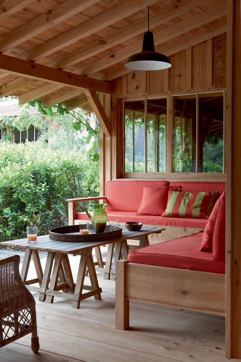
At a Right Angle
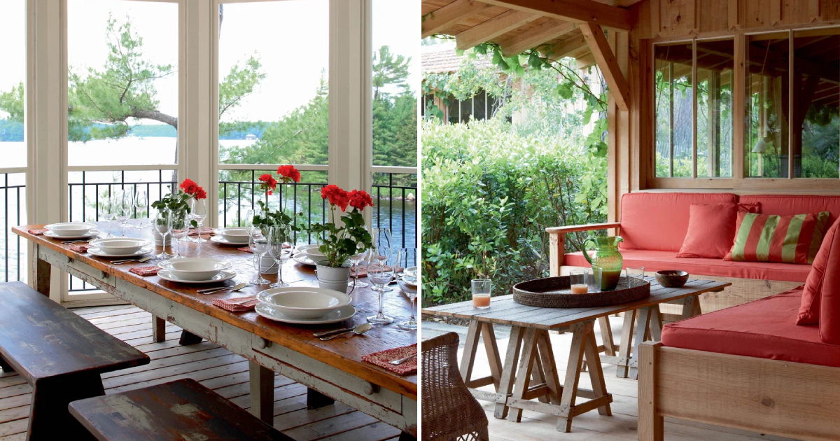
Architect Olga Freiman: “A veranda with a corner sofa is a great idea for a country house. This approach allows for significant space savings. The best location for this area is adjacent to the kitchen, making it easy to set the table and dine in the fresh air. I also want to highlight the pleasant combination of furniture (wooden and wicker) and the fashionable cranberry upholstery color, which stands out beautifully against the greenery.”
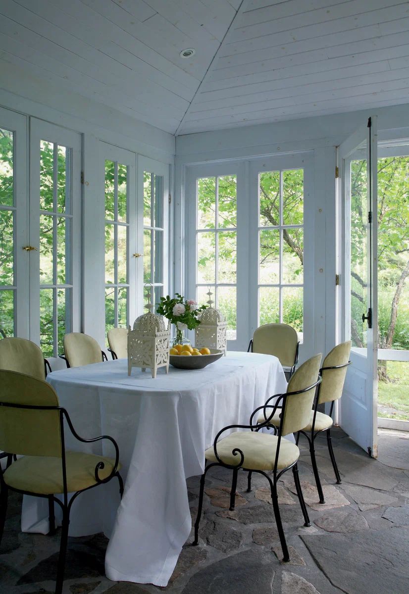
French Accent
Designer Victoria Mansell: “This house with a veranda (16×14 sq. m) is located in a picturesque area near the Muskoka lakes in Canada. Sunlight freely penetrates the rooms through wide windows, and the greenery peeks in. The family usually gathers on the enclosed veranda during lunchtime. The large French table surrounded by antique chairs with curved wrought-iron armrests looks exceptionally festive. The floor is laid with 19th-century granite tiles. The composition is very simple, yet the space turned out refined and elegant.”
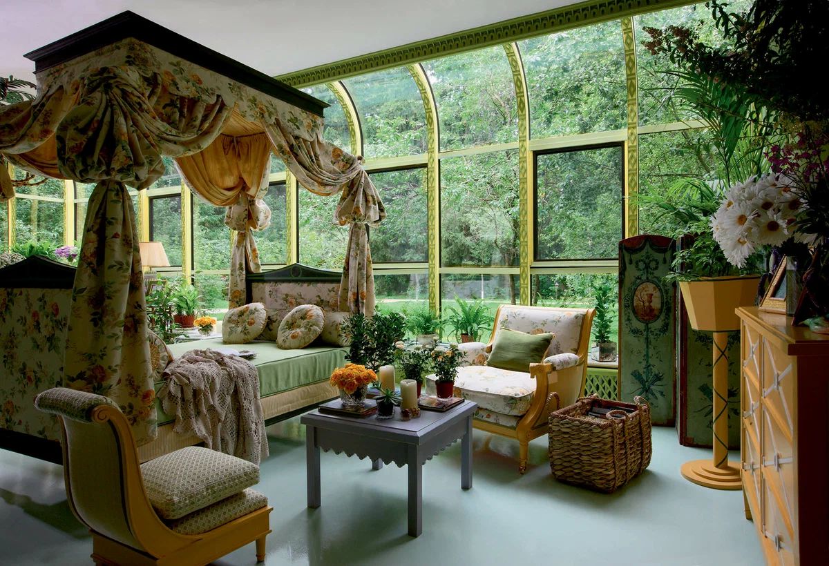
Blooming Time
Decorator Kirill Istomin: “This veranda is atypical for suburban dachas. It is spacious, insulated, and resembles an additional bedroom, living room, or conservatory. The walls are decorated with lattice panels resembling 18th-century park pergolas. At the center of the composition is a luxurious antique bed with a canopy. Thanks to the floral patterns on Sanderson fabrics, the room has a ‘blooming’ appearance not only in summer but all year round.”
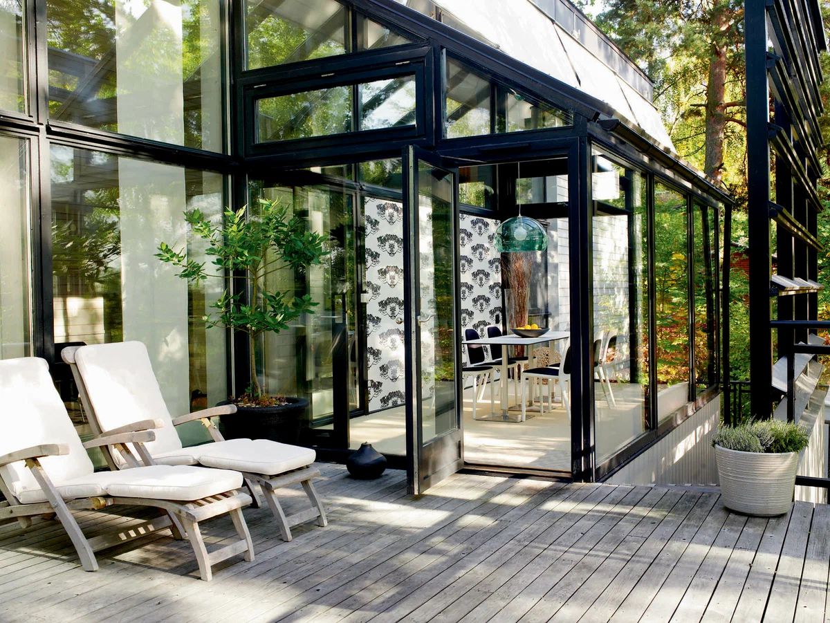
An Extension!
Architect Per Valin: “The construction of this house in Sweden (220 sq. m) was completed in 1996. However, after ten years, the owners decided to expand due to having children. The idea was born to add a terrace and a glass-enclosed veranda to the house, which would be used as a dining area. I tried to ensure that the new elements did not spoil the architecture of the building, and the furniture complemented the interior design. An important piece of advice: it’s not advisable to have a glass-enclosed veranda on the sunny side – it will become too stuffy and hot there.”
Delicate Fabrics
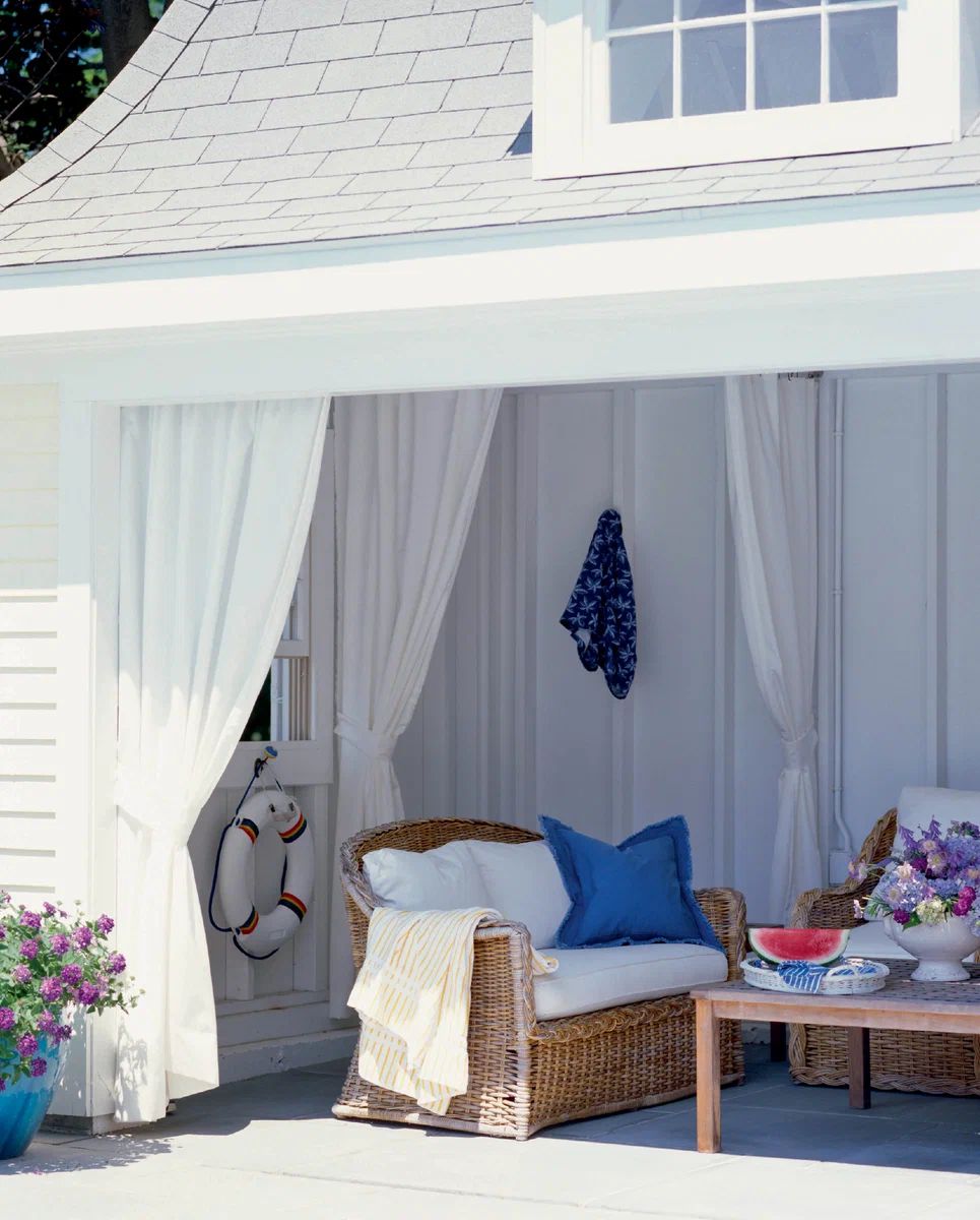
Designer Maxim Languyev: “I really like this project, from the chosen furniture to the color palette and accessories. Wicker sofas with soft seats and cushions are much cozier than the currently popular plastic outdoor furniture. White textiles may not be practical, but they look luxurious in combination with vibrant accents! This veranda would also benefit from torchieres with light linen lampshades. To ensure the longevity of light fabrics, regularly send them for dry cleaning, avoid leaving them under the scorching sun for too long, and consider using removable furniture covers.”
Welcome, it’s Open!
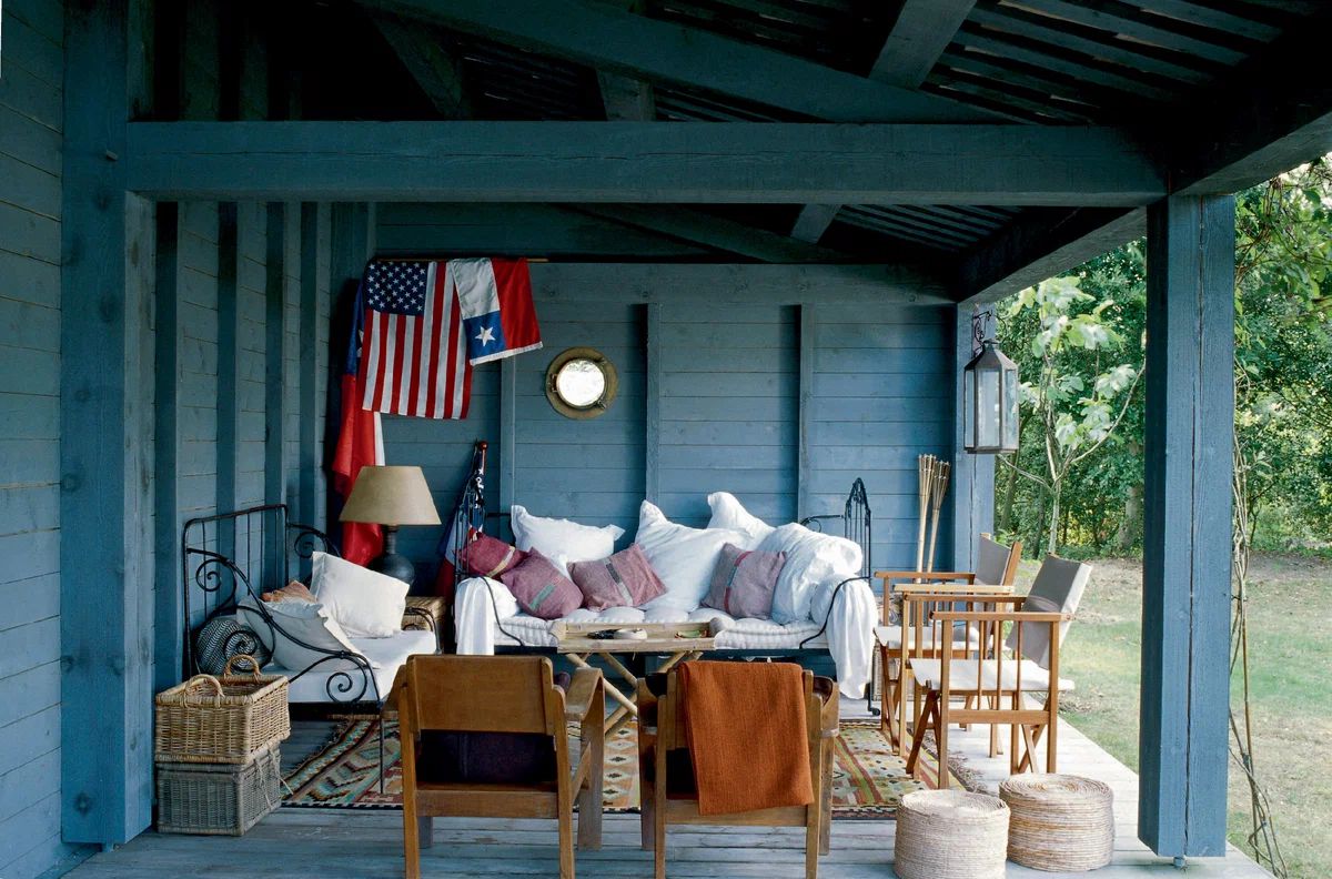
Decorator Anna Erman: “In this project, I see only advantages. Firstly, the ‘eclectic’ furniture is very well selected and combined. Secondly, the lighting is well thought out (in suburban projects, decorators often limit themselves to overhead lighting, forgetting about torchieres and table lamps, which create a more intimate atmosphere). Thirdly, the designer was not afraid to use light textiles that freshen up the space, as well as plush fillings (the pillows are just inviting to lie down on!).”
