The Beauty of a White Garden: A Serene Symphony of Colors
One of the simplest ways to achieve color harmony in a garden is to choose a single color and create a monochromatic garden. One of the most appealing colors for this purpose is white.
I never thought I would be writing about flowers of this color and flowers of that color. And I don’t intend to. Instead, I suggest looking at white blooms from a different perspective, prompted by a remark from landscape designer Ilya Vasetsky.
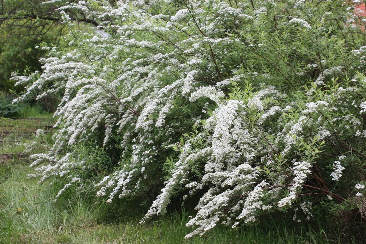
So, like an obedient girl, I isolated all the white flowers in a separate flower bed. There was white delphinium, grown from seeds but eventually turning blue over time, white astilbe, white phlox, white tree hydrangea, cow parsley, and so on.
It is a scientifically proven fact that some people crave something vibrant after winter. If it’s a blooming apple tree, it should be red, and it wouldn’t hurt to add cherry blossoms and almond trees. Red tulips, yellow daffodils, and so on.
However, most people equally rejoice in a white-flowered spring, with lilies of the valley, puschkinias, white daffodils, and the most ordinary apple trees, plums, cherries, and lilacs. Does this mean that we are not tired of winter and its snowy coverings?
More likely, no. Because I don’t just see flowers. I see greenery – youth, renewal… And compared to the color of snow (I don’t know about your region, but in Moscow, it is far from pristine white in spring), white flowers have nothing in common with it.
That’s why I am more inclined towards Lyudmila Belykh’s approach and that of artists. As the mother of an artist, I notice that their attitude towards white is quite ambivalent. The thing is, in a finished work, there should be no blank canvas. One way to achieve that immediately is to choose a tone and work based on it.
The fact is that pure white color goes well with any color, and all colors against its backdrop appear slightly brighter. At the same time, the shades used may not harmonize with each other, and this will not be immediately noticeable. Choosing a “background” simplifies the work for beginner artists.
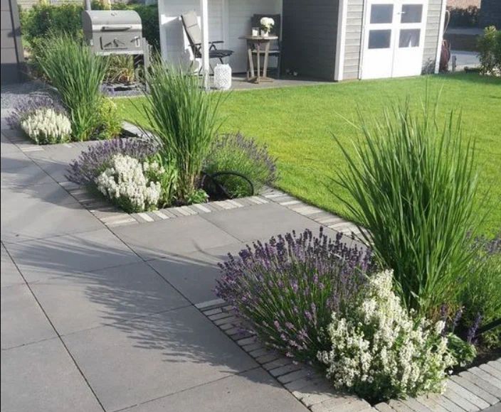
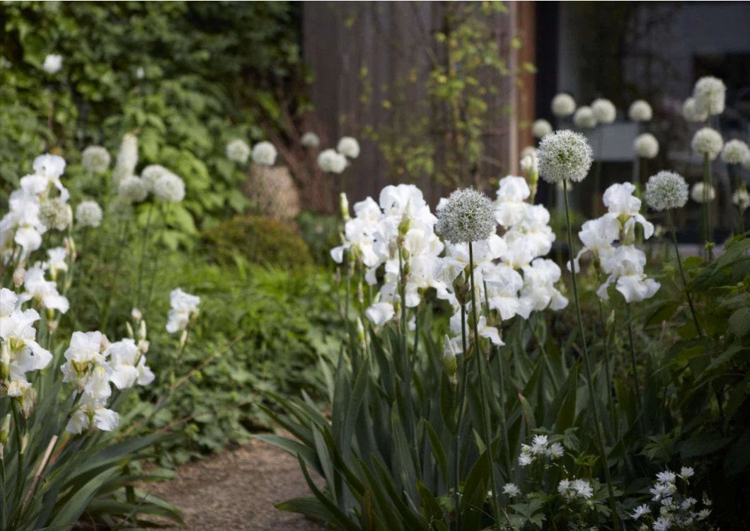
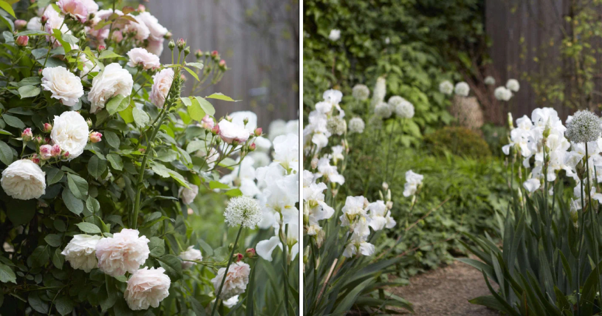
Returning to pure white color, I found a perfect example – Sheila Jack’s garden. She deliberately chose white, and it turned out to be very beautiful:
Let’s keep in mind that a professional photographer worked in the garden, and the time for shooting was carefully chosen.
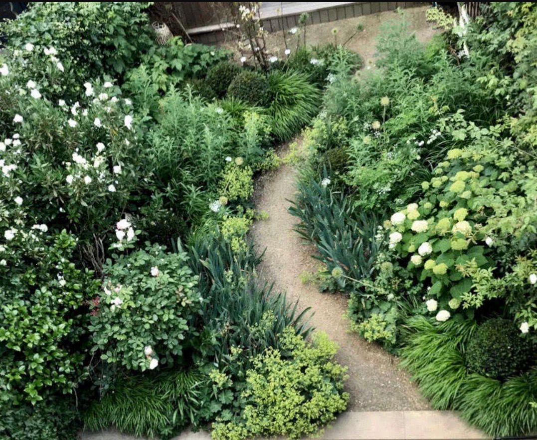
The overall view looks harmonious but somewhat dull:
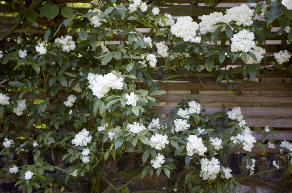
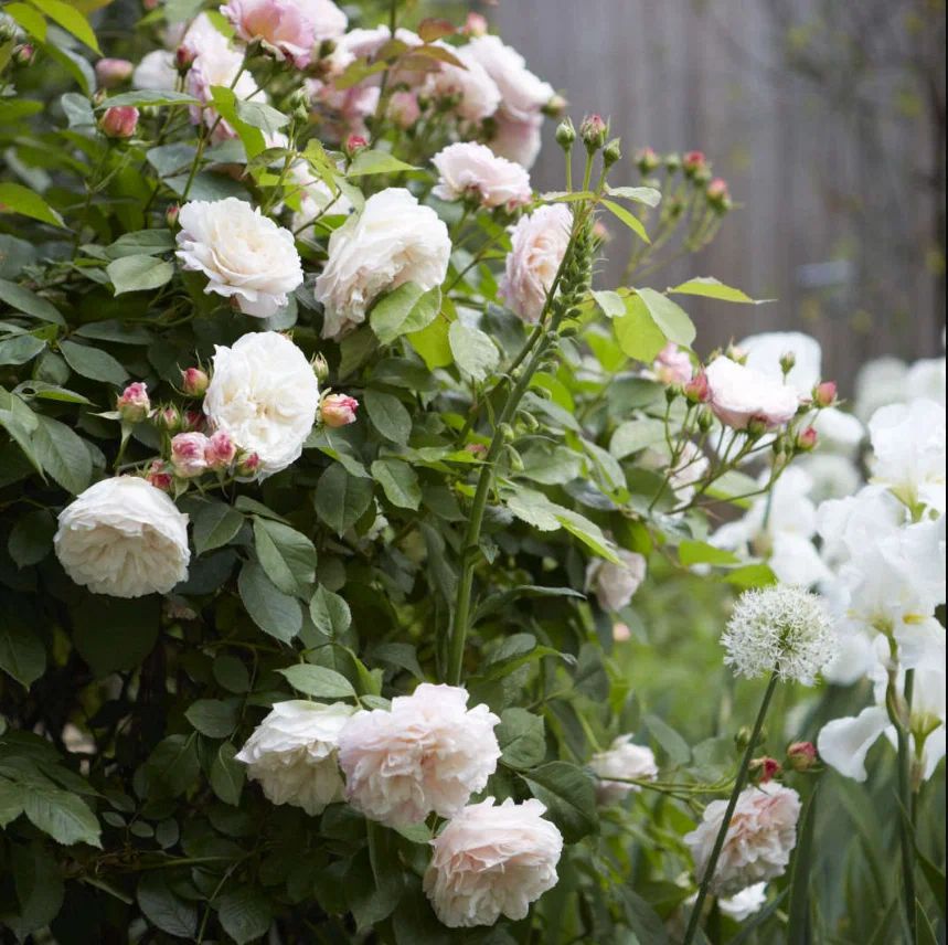
A beautiful white climbing rose:
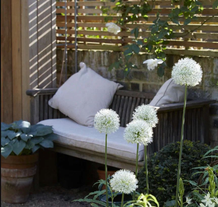
A cozy corner for relaxation:
Those who have dealt with white flowers (and those close to white) should remember how caring for such beauty becomes more complicated. While spiraeas and lilies of the valley fade almost imperceptibly, astilbes, lilacs, and the like acquire rusty hues. Not everyone appreciates such decadent plays.
In Sheila’s white garden, there are also not purely white flowers. For example, the rose has a slight pink tinge. In my opinion, this softens the picture and makes it less demanding: A purely white garden in full bloom still looks too ceremonious.
Personally, I find the white color most appealing in shady flower beds. Firstly, it’s hard to say that a flower gets lost against the backdrop of the sky – there’s always a backdrop. Secondly, they seem to illuminate the space. Mornings are getting brighter here now, but it’s especially noticeable in the evenings.
